The Complete Guide to Cryptocurrency Chart Analysis: Discover classic chart patterns and techniques for identifying trend reversals and continuations. Master trading on Gate with cups, wedges, head and shoulders, triangles, and other critical formations to accurately predict digital asset prices.
Introduction to the Cryptocurrency Market and the Importance of Technical Analysis
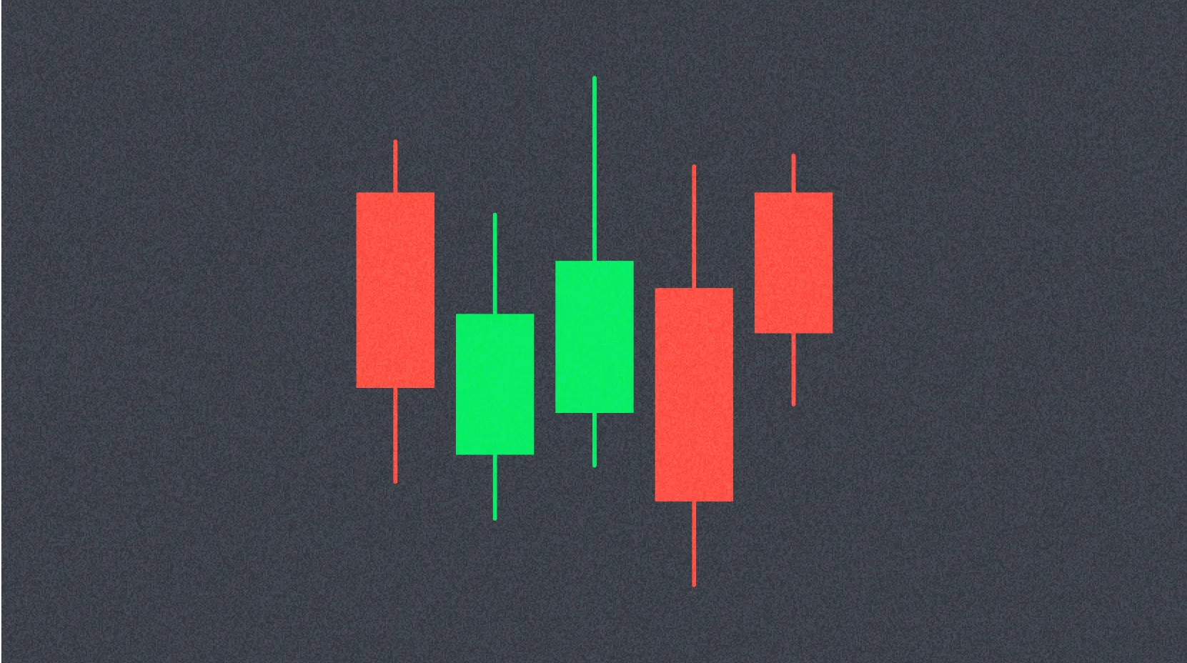
In the past decade, the cryptocurrency market has become one of the most dynamic arenas for investment and speculative trading. Like traditional financial markets, the crypto sector displays recognizable patterns and trends in price movements. Systematic analysis of these recurring market behaviors enables traders to forecast future price movements.
Mastering cryptocurrency chart patterns is essential for technical analysis. This expertise allows traders and investors to make informed decisions on entry and exit points, manage risk, and refine their trading strategies. Technical chart analysis provides a visual representation of market sentiment and helps identify potential trend reversals.
This comprehensive guide explores the most important cryptocurrency chart patterns, breaks down their structure and characteristics, and delivers practical guidance for using them in trading.
What Are Cryptocurrency Chart Patterns?
Chart patterns are visually identifiable formations that occur on cryptocurrency price charts. Traders and investors use these graphical models to pinpoint potential price directions and determine the best moments to execute trades.
These patterns result from the interplay of supply and demand in the market and reflect trader psychology. Recognizing patterns allows traders to anticipate market moves and make strategic buy or sell decisions.
Bullish patterns signal a potential upward price move. When traders spot these formations, they typically open long positions in anticipation of an asset’s appreciation. For instance, a bullish pattern forming after a prolonged downtrend can signal a market reversal and the start of an uptrend.
Bearish patterns, by contrast, warn of likely price declines. In such cases, traders close long positions or open shorts to lock in profits before a drop or capitalize on downward momentum. Identifying bearish signals early helps minimize potential losses.
What Are the Most Common Cryptocurrency Chart Patterns?
Trading charts can show multiple patterns across various timeframes simultaneously. A thorough grasp of their visual traits and identification methods is crucial for effective trading decisions. Below are the most frequent and reliable patterns on cryptocurrency charts.
Cup and Handle
The cup and handle is a classic bullish continuation pattern, usually signaling a significant upward price move. The formation’s name comes from its distinctive shape, resembling a teacup with a handle in profile.
The pattern starts with a rounded, U-shaped curve—the “cup.” This segment typically forms during periods of market consolidation, when price gradually declines, bottoms out, and then steadily recovers to levels near the origin point.
Once the cup forms, the chart displays a brief pullback that creates the “handle.” For the handle to emerge, the asset price must undergo a short-term dip, generally one-third to one-half the depth of the cup. This decline is temporary and presents the final opportunity to accumulate positions ahead of a breakout.
After the handle completes, price usually breaks resistance and surges upward, continuing the previous bullish trend. Traders typically enter long positions on a resistance breakout with increased trading volume, confirming the move’s strength.
Wedges
Wedges are a critical category of chart patterns, divided into rising and falling types. Each has distinct characteristics and trading implications.
Rising wedges are generally bearish reversal signals. This pattern forms between two converging, upward-sloping trendlines. The upper trendline is steeper than the lower, indicating weakening bullish momentum as each new high is reached with less force. A breakdown below the wedge’s lower boundary typically signals the start of a downtrend.
Falling wedges, in contrast, are bullish reversal patterns. They form when two converging trendlines slope downward, with the lower line steeper than the upper. This structure shows that bearish pressure is dissipating. Each subsequent low is less pronounced, signaling accumulation by buyers. A breakout above the wedge’s upper boundary often triggers a strong bullish move, so traders view the falling wedge as a high-potential bullish reversal pattern.
Head and Shoulders
The head and shoulders pattern is one of the most reliable trend reversal formations in technical analysis. It has appeared in the cryptocurrency market for years and is highly accurate at predicting trend changes.
This pattern is easy to recognize thanks to its structure of three consecutive peaks. The central peak, the highest, forms the “head.” The two side peaks, similar in height, form the “left” and “right shoulders.”
The pattern’s base is called the “neckline”—a support line connecting the lows between the peaks. This bearish formation indicates the market is shifting into a downtrend, and price is likely to continue falling after a neckline break.
Traders typically open short positions when the neckline breaks down, setting profit targets equal to the distance from the head to the neckline. Volume is a crucial confirmation factor: it should decrease during the right shoulder and spike on a neckline break.
Ascending and Descending Triangle
Triangle patterns are very common in the crypto market, signaling consolidation before a trend continues or reverses.
The ascending triangle is a classic bullish continuation or reversal formation. It features a horizontal resistance line on top and an ascending trendline below, gradually converging to form a triangle pointing right and upward. The pattern forms as price repeatedly tests the horizontal resistance but fails to break it, while successive lows rise. This reflects mounting buying pressure. A breakout near the triangle’s top third, with rising volume, confirms the bullish move.
The descending triangle is the mirror image—bearish in nature. Here, a horizontal support line on the bottom converges with a downward-sloping upper trendline, creating a downward-pointing triangle. Price tests support repeatedly, showing buyers can’t defend the level, while highs keep dropping. This bearish signal warns of a likely decline after support breaks. Traders usually open shorts on a breakdown, expecting the downtrend to continue.
Double and Triple Top
The double top is a classic bearish reversal pattern, signaling that bullish momentum is exhausted. It forms when the price hits a new local or all-time high, retreats to an intermediate low, then tries to retest or slightly exceed the high a second time.
The key is that the second peak typically fails to surpass the first, or does so only marginally, after which price reverses lower. The support line through the intermediate low—the “confirmation line”—marks completion. A breakdown here confirms the pattern and signals short entries.
The triple top is a reinforced version, showing even greater buyer exhaustion. Price rises to the resistance level three times, fails each time, and then breaks support. Three failed attempts to break resistance suggest the bullish trend is losing steam, with a strong reversal likely.
Both patterns require confirmation from increased volume on the breakdown. The target decline is measured from the peaks to the support line and projected downward from the breakout point.
Double Bottom
The double bottom is a reliable bullish reversal signal—essentially the mirror image of the double top. It consists of two consecutive price dips to roughly the same level, with an intermediate peak in between.
The pattern begins when price hits a local low after a downtrend, then rebounds to an intermediate high. Price falls again, retesting the first low or dipping just below. The critical point is that the second bottom doesn’t produce a significant new low, indicating bearish pressure is spent and buyers are stepping in at these levels.
This pattern signals sellers are exhausted and buyers are defending the price. The resistance line through the intermediate peak—the confirmation line or neckline—marks the breakout. A move above this line with rising volume confirms the pattern and signals long entries.
Traders usually determine the profit target by measuring the vertical distance from the bottom to the confirmation line and projecting it upward from the breakout. The pattern’s reliability increases when volume is lower on the second bottom than the first, then surges on the breakout.
Why Charts Matter for Crypto Traders
For anyone seeking success in digital asset trading, understanding and recognizing crypto chart patterns is a vital skill. While technical analysis is not infallible and cannot predict outcomes with perfect accuracy, it substantially increases the odds of making sound trading decisions.
Chart patterns do not always yield the same results due to unique market conditions and outside influences on crypto. Still, systematic technical analysis gives traders a structured method for studying market dynamics, identifying entry and exit points, and managing risk.
Combining patterns with other technical tools—like indicators, support and resistance, and volume analysis—enables more precise forecasts and better decisions. Consistent practice spotting patterns in historical and real-time data sharpens trader intuition and improves strategy performance.
Remember, successful trading requires a holistic approach that includes technical and fundamental analysis, capital management, and psychological discipline. Chart patterns are powerful tools, but should always be used as part of a broader strategy.
FAQ
What are cryptocurrency chart patterns and why do they matter for traders?
Chart patterns are recurring price formations that help traders forecast market moves. They matter because they identify entry and exit points, reveal trends, and support informed trading decisions based on historical price action.
How do you identify and use the most common chart patterns (like head and shoulders, double top, triangle, etc.)?
Identify patterns using key support and resistance levels. Head and shoulders: three peaks with the center highest; double top: two equal peaks; triangle: converging trendlines. Use breakouts and trading volume to confirm trend reversal signals.
How do you identify and use support and resistance levels in technical analysis?
Support is a price where the asset often rebounds; resistance is where it faces selling. Identify these by historical highs and lows on the chart. Use them as entry points on support bounces and exit points near resistance. A breakout signals a trend shift and further movement.
What are moving averages and the Relative Strength Index (RSI), and how should they be interpreted?
Moving averages smooth price data and show trend direction. RSI measures momentum from 0 to 100; above 70 signals overbought, below 30 signals oversold. These tools help spot entry and exit points and enhance trading decisions.
How accurate is chart pattern analysis for cryptocurrency trading, and what are its limitations?
Chart patterns are about 60–70% accurate if used correctly, but are limited by market unpredictability. Effectiveness depends on trading volume, timeframes, and volatility. They work best on longer timeframes, but profits aren’t guaranteed due to news and speculation.
How can you combine multiple chart patterns and indicators to build a trading strategy?
Combine patterns (like head and shoulders) with indicators (MACD, RSI) to confirm signals. Analyze trading volume and trends together. Use support and resistance for entries and exits. This multifactor approach raises forecast precision.
What are the differences in chart analysis across timeframes (daily, 4-hour, 1-hour)?
Daily charts reveal long-term trends and major moves; 4-hour charts show intermediate patterns; 1-hour charts highlight short-term fluctuations. Each timeframe features different support, resistance, and volume, affecting analysis accuracy.
How should beginners learn and practice cryptocurrency chart analysis?
Start by studying basic patterns (candlesticks, trends, support levels). Use free tools to practice with historical data. Analyze charts across timeframes, track trading volume and price moves, and keep a trading journal to monitor progress.
* The information is not intended to be and does not constitute financial advice or any other recommendation of any sort offered or endorsed by Gate.