Master reading candlestick charts for cryptocurrencies as a beginner. Uncover how to interpret candlestick patterns, apply technical analysis using candlesticks, and develop trading strategies on Gate. This is your complete guide for traders.
Introduction
For newcomers to trading or investing, chart reading can seem daunting. Many rely on hunches and make investment decisions based on intuition. However, trading and investing are fundamentally about probability and risk management. That's why understanding how to read candlestick charts is essential for nearly any investment approach, no matter your experience level.
What Is a Candlestick Chart?
A candlestick chart is a financial chart that visually displays an asset’s price movement over a defined time interval. Each chart consists of candles, with each candle representing the same duration. Candles can depict any timeframe—ranging from seconds to years—making them versatile tools for different analytical strategies.
Candlestick charts trace back to the 17th century. They are widely credited to a Japanese rice trader named Homma, who used them to analyze rice prices. His concepts likely formed the foundation for today’s modern candlestick charts, which are now a cornerstone of technical analysis.
How Do Candlestick Charts Work?
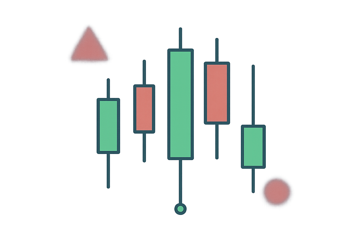
Candlestick charts display four key price points within a specific timeframe. Each candle is constructed using these data points:
- Open — The initial trading price of the asset in the timeframe.
- High — The highest trading price of the asset recorded in the timeframe.
- Low — The lowest trading price of the asset recorded in the timeframe.
- Close — The final trading price of the asset in the timeframe.
The distance between the open and close forms the “body,” while the space between these points and the high or low is known as the wick or shadow. This structure enables traders to quickly assess price direction and volatility for the analyzed period.
How to Read Candlestick Charts
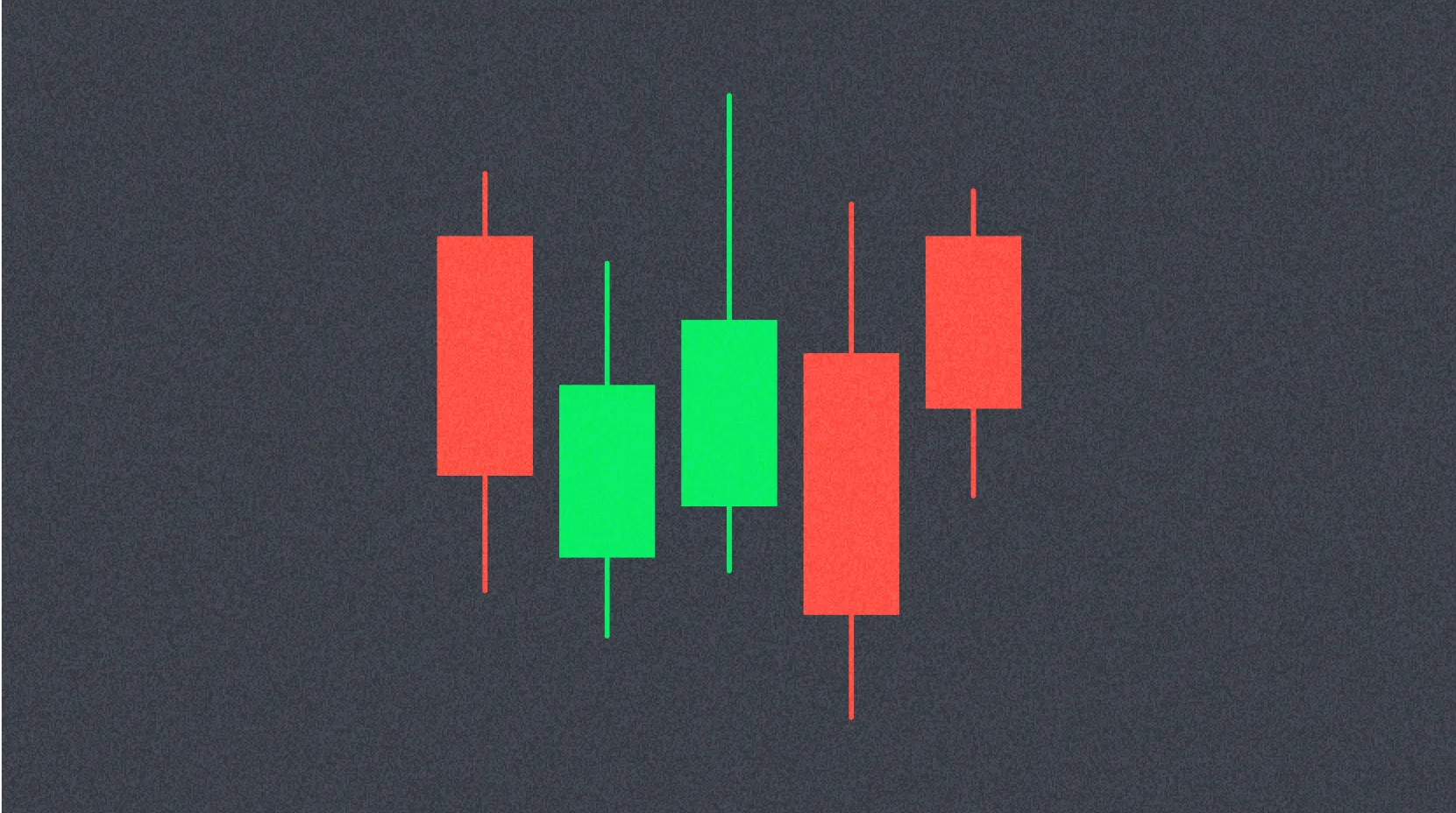
Most traders find candlestick charts easier to interpret than traditional bar or line charts. Each candle reflects the struggle between buyers (bulls) and sellers (bears) within a specific period. A longer body signals stronger buying or selling momentum during that timeframe.
The color of the candle is crucial for reading market direction. A green body means the asset closed higher than it opened, indicating upward (bullish) pressure. Conversely, a red body shows the price fell during the period, with the close below the open, signaling downward (bearish) pressure. Wicks also offer insights into price rejection or reversal attempts.
What Candlestick Charts Don’t Reveal
While candlesticks give a useful overview of price action, they don’t offer every detail for thorough analysis. They only show the open and close distance, not the full price action between those points. This means significant price swings within the period may go unrepresented by the candle’s appearance.
Candlestick charts can also introduce substantial market noise, especially on shorter timeframes. This noise can trigger false signals that mislead less experienced traders. As a result, many analysts combine candlestick charts with other technical indicators and analysis tools for a more comprehensive market perspective.
Heikin-Ashi Candles
Heikin-Ashi, which translates to “average bar” in Japanese, refers to a modified candlestick chart that calculates candles using average price data. This approach distinguishes Heikin-Ashi from traditional Japanese candlesticks. Its main purpose is to smooth price movements and filter out market noise, giving a clearer view of underlying trends.
Traders frequently use Heikin-Ashi candles alongside standard candlesticks to avoid false signals and improve market trend detection. Green Heikin-Ashi candles without lower wicks generally signal a strong uptrend, while red candles without upper wicks can indicate a strong downtrend. This combination helps analysts pinpoint trend reversals with greater accuracy.
Conclusion
Candlestick charts are foundational tools for traders and investors aiming to understand market dynamics. They not only provide a clear visual record of an asset’s price action, but also allow flexible analysis across multiple timeframes, supporting a range of trading strategies.
Systematic study of candlestick charts and patterns, paired with analytical thinking and hands-on practice, can give traders a decisive edge. Mastering this core skill is a key step toward building a robust and profitable investment strategy.
FAQ
What is a candlestick chart and how does it work?
A candlestick chart visualizes price quotes using geometric shapes. The body shows the gap between open and close (green for rises, red for declines). Wicks mark the period’s highest and lowest prices, helping you analyze market moves.
What are the main components of a candlestick (open, close, high, low)?
Each candlestick consists of four key elements: open (starting price), close (ending price), high (maximum price), and low (minimum price) within a given period. These elements create the candle’s body and wicks.
What’s the difference between a bullish (green) and a bearish (red) candle?
A bullish (green) candle means the price closed above the open, indicating buyer strength. A bearish (red) candle means the price closed below the open, showing seller control.
A hammer pattern signals a bullish reversal after a drop; an inverted hammer points to a bearish reversal; a doji indicates market indecision when open and close are nearly equal. Always use these in conjunction with other analytical tools.
Which timeframes should beginners use to read candlestick charts?
As a beginner, start with 5- to 15-minute timeframes. These intervals highlight clear trends without overloading your analysis. Once comfortable, progressively move to longer timeframes like hourly or daily charts.
What are the most basic buy and sell signals in candlestick charts?
Basic buy signals include hammers at support levels, while shooting stars at resistance suggest sells. Also, look for small bodies with long wicks and shifts in trading volume to confirm trend changes.
* The information is not intended to be and does not constitute financial advice or any other recommendation of any sort offered or endorsed by Gate.