This comprehensive guide equips beginners with essential skills to analyze cryptocurrency market trends through multiple technical analysis methods. Covering fundamental concepts like moving averages, support and resistance levels, and candlestick formations, the article provides practical tools for chart interpretation across Gate and other platforms. You'll master key indicators including RSI, MACD, and Bollinger Bands, plus learn to identify reversal and continuation patterns that signal potential trading opportunities. The guide explains Bitcoin dominance metrics and order book analysis to understand market psychology and capital flows. Real-world scenarios and actionable insights help traders avoid common mistakes and make informed decisions by combining multiple analytical approaches across different timeframes.
How to Read Cryptocurrency Charts?
There are two primary methods for analyzing the market: technical analysis and fundamental analysis. Both approaches offer unique insights into market behavior and help traders make informed decisions.
Technical Analysis vs Fundamental Analysis
Technical analysis predicts future price movements based on historical price data, trading volume, and chart patterns. This method is particularly suitable for short-term and medium-term investments, allowing traders to respond quickly to market changes. Technical analysts believe that all relevant information is reflected in the price, and historical patterns tend to repeat themselves.
Fundamental analysis evaluates the intrinsic value of an asset to predict its long-term value. This approach examines the financial health of companies and industry trends, making it ideal for long-term investment strategies. Fundamental analysts focus on factors such as project development, team credibility, adoption rates, and real-world utility.
What is Technical Analysis?
Technical analysis is a methodology that uses price charts to identify trends, support and resistance levels, and momentum in asset values, thereby increasing the probability of investment success. This approach operates under the premise that asset prices move in trends and that prices change according to market sentiment. Technical analysts use various tools and indicators to interpret price movements and predict future behavior.
The core principle behind technical analysis is that market prices reflect all available information, including fundamental factors, market psychology, and supply and demand dynamics. By studying historical price patterns and chart formations, traders can identify potential entry and exit points for their trades.
Bitcoin Chart Websites and Real-Time Crypto Charts
Cryptocurrency Exchanges
Several platforms provide comprehensive charting tools for cryptocurrency trading:
- Major Exchange A: Offers detailed and diverse technical analysis tools with advanced charting capabilities, including multiple timeframes and a wide range of indicators
- Korean Exchange Platform: Provides Korean language support and user-friendly interface tailored for domestic users, featuring intuitive navigation and local payment methods
- Leading Korean Exchange: One of the top two exchanges in Korea, offering a Korean language environment with robust security features and high liquidity
- User-Friendly Exchange: Features a beginner-friendly interface with simplified trading options and educational resources for new traders
- Professional Trading Platform: Designed for professional traders with advanced order types, margin trading, and sophisticated analytical tools
Dedicated charting platforms offer enhanced analytical capabilities:
- TradingView: Provides hundreds of technical indicators and integrates data from various exchanges. This platform is widely regarded as the industry standard for technical analysis, offering social trading features, custom indicators, and advanced drawing tools
- CoinMarketCap: Delivers comprehensive cryptocurrency information including market capitalization, trading volume, price history, and project details. The platform aggregates data from multiple sources to provide accurate market overviews
- CoinGecko: Offers charts and cryptocurrency information with additional metrics such as developer activity, community engagement, and liquidity scores
Moving Averages
Moving averages are fundamental technical indicators that filter out random noise from short-term price fluctuations and help identify trends. They smooth out price data by creating a constantly updated average price over a specific period.
- Simple Moving Average (SMA): Calculates the average price over a defined period by adding closing prices and dividing by the number of periods. For example, a 50-day SMA adds the closing prices of the last 50 days and divides by 50
- Exponential Moving Average (EMA): Assigns greater weight to more recent prices, making it more responsive to new information. The EMA reacts faster to price changes compared to the SMA, which is why many traders prefer it for short-term trading
The most commonly used moving average periods in cryptocurrency trading are 50-day and 200-day intervals. These periods have become standard benchmarks in the industry, with many traders watching them closely for trend confirmation and reversal signals.
Golden Cross and Death Cross
These are significant technical signals that occur when moving averages intersect:
- Golden Cross: Occurs when the 50-day moving average crosses above the 200-day moving average, indicating a bullish signal. This pattern suggests that short-term momentum is overtaking long-term trends, potentially signaling the start of an uptrend. Historical data shows that golden crosses often precede substantial price increases
- Death Cross: Happens when the 50-day moving average crosses below the 200-day moving average, indicating a bearish signal. This pattern suggests weakening momentum and potential downtrend continuation. Traders often use death crosses as warnings to reduce exposure or exit positions
Support and Resistance Lines
These are critical price levels that influence market behavior:
- Resistance Line: A price level where selling pressure tends to emerge, causing prices to decline. Resistance forms when sellers outnumber buyers at a particular price point, creating a ceiling that prices struggle to break through
- Support Line: A price level where buying pressure tends to emerge after a decline, causing prices to bounce back. Support forms when buyers outnumber sellers, creating a floor that prevents further price decreases
When prices break through these zones, it's called a "breakout." After a breakout, traders look for the next support or resistance zone. Breakouts are often accompanied by increased volume, which confirms the strength of the move. Failed breakouts, where prices quickly reverse after breaking a level, can indicate false signals and potential trend reversals.
Fibonacci Retracement
Fibonacci retracement analysis uses historical price and volume data to predict future price trends. This technique is based on the mathematical sequence discovered by Leonardo Fibonacci, which appears frequently in nature and financial markets.
Key Fibonacci ratios include: 0.236, 0.382, 0.500, 0.618, and 0.786. These levels represent potential areas where prices may reverse and resume their primary trend. The 0.618 level, also known as the "golden ratio," is particularly significant and often acts as a strong support or resistance level.
Traders use Fibonacci retracement by identifying a significant price move (either up or down) and then drawing the Fibonacci levels between the high and low points. Prices tend to retrace to these levels before continuing in the original direction. For example, during an uptrend, if Bitcoin rises from $30,000 to $40,000, the 0.618 retracement level would be around $33,820, which might serve as a potential buying opportunity.
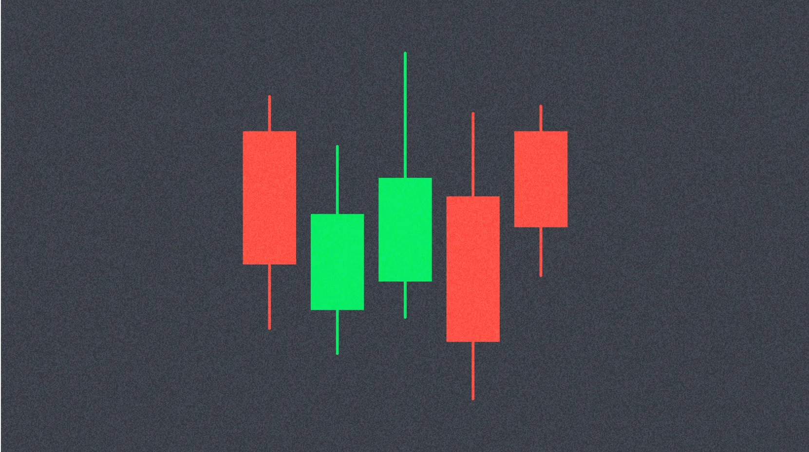
Candlestick charts visually represent the opening price, high price, low price, and closing price for a specific period. This charting method originated in 18th-century Japan and has become the most popular format for displaying price data in financial markets.
Key Components
- Opening Price (Open): The first traded price during the specified period
- High Price (High): The highest traded price during the period
- Low Price (Low): The lowest traded price during the period
- Closing Price (Close): The last traded price during the specified period
Candlestick Structure
- Body: The range between the opening and closing prices. A thick body indicates significant price movement during the period
- Bullish Candle: Forms when the closing price is higher than the opening price, typically displayed in white or green. This indicates buying pressure dominated during the period
- Bearish Candle: Forms when the closing price is lower than the opening price, typically displayed in black or red. This indicates selling pressure dominated during the period
- Shadows (Wicks): Lines extending from the body that indicate the high and low prices
- Upper Shadow: Extends above the body, showing how far prices rose above the opening or closing price
- Lower Shadow: Extends below the body, showing how far prices fell below the opening or closing price
Long shadows indicate strong rejection of price levels, while short shadows suggest prices remained close to opening or closing levels. Candlesticks with very small bodies and long shadows often indicate market indecision.
Time Frames
Different time frames suit different trading styles and strategies:
- Ultra Short-Term: 1-minute, 5-minute, 15-minute, 30-minute charts (for day traders who execute multiple trades within a single day)
- Short-Term: 1-hour, 4-hour charts (for short-term traders focusing on intraday to multi-day moves)
- Medium-Term: Daily, weekly charts (for swing traders holding positions for days to weeks)
- Long-Term: Monthly charts (for long-term investors with holding periods of months to years)
Using multiple time frames allows investors to prepare for unexpected events and understand the complete market picture. For example, a trader might use a daily chart to identify the overall trend, a 4-hour chart to find entry points, and a 1-hour chart to fine-tune timing. This multi-timeframe analysis helps avoid false signals and improves trade accuracy.
Cryptocurrency Chart Patterns
Chart patterns are formations created by price movements that tend to repeat over time, providing traders with visual cues about potential future price direction.
1. Reversal Patterns
Reversal patterns signal potential trend changes:
Head and Shoulders
- Head and Shoulders Top: Appears after an uptrend and signals a bearish reversal. This pattern consists of three peaks: a left shoulder, a higher head, and a right shoulder at approximately the same height as the left shoulder. The neckline connects the lows between the shoulders and head
- Head and Shoulders Bottom (Inverse): Appears after a downtrend and signals a bullish reversal. This is the mirror image of the top pattern, with three troughs instead of peaks
Double Top and Double Bottom
- Double Top: Features two peaks at approximately the same height, indicating a bearish reversal signal. This pattern forms when prices fail to break through a resistance level twice, suggesting exhaustion of buying pressure
- Double Bottom: Features two troughs at approximately the same height, indicating a bullish reversal signal. This pattern forms when prices fail to break through a support level twice, suggesting exhaustion of selling pressure
Triple Top and Triple Bottom
- Triple Top: Features three peaks at similar heights, providing a stronger bearish reversal signal than a double top. The third failed attempt to break resistance confirms the reversal
- Triple Bottom: Features three troughs at similar heights, providing a stronger bullish reversal signal than a double bottom. The third failed attempt to break support confirms the reversal
2. Continuation Patterns
Continuation patterns suggest the existing trend will resume:
Triangles
- Symmetrical Triangle: Signals continuation of the existing trend, formed by converging trendlines with lower highs and higher lows. Breakout direction typically follows the preceding trend
- Ascending Triangle: Signals continuation of an uptrend, characterized by a flat upper resistance line and rising lower support line. This pattern indicates accumulation and building buying pressure
- Descending Triangle: Signals continuation of a downtrend, characterized by a flat lower support line and declining upper resistance line. This pattern indicates distribution and building selling pressure
Flags and Pennants
- Flag: Forms after a strong price movement, creating a small symmetrical channel that slopes against the prevailing trend. Flags typically resolve with a breakout in the direction of the initial move
- Pennant: Forms after a strong price movement, creating a small symmetrical triangle. Like flags, pennants usually resolve in the direction of the preceding trend
Rectangle: Characterized by horizontal price fluctuations within a defined range, with parallel support and resistance levels. Rectangles represent consolidation periods where buyers and sellers are in equilibrium.
Other Technical Indicators
Relative Strength Index (RSI)
The RSI measures whether an asset is overbought or oversold by comparing the magnitude of recent gains to recent losses. It's displayed on a scale from 1 to 100:
- Below 30: Indicates oversold conditions, suggesting potential buying opportunities
- Above 70: Indicates overbought conditions, suggesting potential selling opportunities
The RSI can also identify divergences between price and momentum. For example, if prices make new highs while RSI makes lower highs, this bearish divergence suggests weakening momentum and potential reversal.
Moving Average Convergence Divergence (MACD)
The MACD consists of three components: the MACD line, signal line, and histogram:
- MACD Line Crossing Above Signal Line: Generates a buy signal, indicating increasing bullish momentum
- MACD Line Crossing Below Signal Line: Generates a sell signal, indicating increasing bearish momentum
The histogram represents the difference between the MACD and signal lines, providing visual confirmation of momentum changes. Increasing histogram bars indicate strengthening momentum, while decreasing bars suggest weakening momentum.
Stochastic Oscillator
The Stochastic Oscillator compares a closing price to its price range over a specific period:
- %K Line Above 80: Indicates rapid upward movement and potential overbought conditions
- %K Line Below 20: Indicates rapid downward movement and potential oversold conditions
Traders often wait for the %K line to cross the %D line (signal line) before taking action, as this provides confirmation of momentum shifts.
Parabolic SAR (Stop and Reverse)
The Parabolic SAR appears as dots on the chart that indicate potential trend reversal points:
- During an uptrend: Dots appear below the price, trailing upward as the trend continues
- During a downtrend: Dots appear above the price, trailing downward as the trend continues
When dots switch sides (from below to above or vice versa), it signals a potential trend reversal. This indicator is particularly useful for setting stop-loss orders.
Bollinger Bands
Bollinger Bands consist of a moving average line and two standard deviation bands above and below it:
- Price Near Upper Band: Suggests overbought conditions and potential reversal or consolidation
- Price Near Lower Band: Suggests oversold conditions and potential reversal or consolidation
- Narrowing Bands: Indicates decreasing volatility and potential for a significant price move (squeeze)
- Widening Bands: Indicates increasing volatility and strong trending behavior
Bollinger Bands are particularly effective when combined with other indicators. For example, when prices touch the lower band and RSI shows oversold conditions, this provides stronger confirmation of a potential buying opportunity.
How to Read Bitcoin Dominance Charts
Bitcoin dominance represents the percentage of total cryptocurrency market capitalization that Bitcoin accounts for. This metric provides insights into capital flows between Bitcoin and alternative cryptocurrencies (altcoins).
How to Check Bitcoin Dominance Charts
- TradingView: Search for the symbol
BTC.D or BTC.D.X to view real-time dominance data with full charting capabilities
- CoinMarketCap: Displays dominance percentage prominently on the main page, along with historical charts
- CoinGecko: Provides market capitalization and dominance information with detailed breakdowns by category
Key Scenarios
Scenario 1: Rising Bitcoin Dominance
Rising Bitcoin dominance indicates that investors are withdrawing funds from altcoins or directing new capital into Bitcoin:
- Bitcoin Price Rising + Dominance Rising: Bitcoin is leading the market with concentrated capital inflows. This typically occurs during bull market beginnings or when investors seek relative safety in the most established cryptocurrency
- Bitcoin Price Falling + Dominance Rising: Capital is fleeing from altcoins to Bitcoin as a relative safe haven. This often happens during market corrections when investors reduce risk by consolidating into Bitcoin
Scenario 2: Falling Bitcoin Dominance
Falling Bitcoin dominance indicates investors are moving capital from Bitcoin to altcoins, signaling the potential beginning of altcoin season:
- Bitcoin Price Rising + Dominance Falling: Altcoins are rising at a faster rate than Bitcoin. This is the classic altcoin season scenario, where profits from Bitcoin gains flow into alternative cryptocurrencies seeking higher returns
- Bitcoin Price Falling + Dominance Falling: Altcoins are falling more sharply than Bitcoin. This represents a risk-off environment where speculative assets suffer disproportionately
Scenario 3: Sideways Bitcoin Dominance
Sideways movement in Bitcoin dominance indicates no clear trend in the market or balanced capital flows between Bitcoin and altcoins. This often occurs during consolidation periods or when market participants are uncertain about future direction.
Important Considerations for Dominance Chart Analysis
- Not an absolute indicator: Dominance should be used in conjunction with other metrics
- Requires combination with other indicators: Price action, volume, and sentiment indicators provide additional context
- Temporary effects: Sudden surges or crashes in specific altcoins can temporarily distort dominance figures
- Focus on long-term trends: Short-term fluctuations may not be meaningful; pay attention to sustained changes over weeks or months
Understanding Bitcoin dominance helps traders identify market cycles and optimize portfolio allocation between Bitcoin and altcoins.
Understanding the Order Book
The order book is an electronic ledger that displays real-time buy and sell orders for a specific asset in financial markets. It provides transparency into market depth and liquidity, helping traders understand supply and demand dynamics.
Components of the Order Book
Bid Orders (Buy Orders)
Bid orders represent intentions to purchase an asset at specific prices. They are sorted from highest to lowest price, with the highest bid (best bid) at the top. The bid side shows how much buyers are willing to pay and the quantities they want to purchase at each price level.
Ask Orders (Sell Orders)
Ask orders represent intentions to sell an asset at specific prices. They are sorted from lowest to highest price, with the lowest ask (best ask) at the top. The ask side shows the prices at which sellers are willing to sell and the quantities available at each price level.
Using the Order Book
The order book provides valuable insights for trading decisions:
- Market Supply and Demand: Visualizes the balance between buyers and sellers
- Strong Buying Pressure: When bid orders significantly outnumber ask orders, indicating potential upward price movement
- Strong Selling Pressure: When ask orders significantly outnumber bid orders, indicating potential downward price movement
- Liquidity Assessment: Large orders at various price levels indicate high liquidity, allowing traders to enter and exit positions with minimal slippage
Traders can identify support and resistance levels by observing large order clusters in the order book. Additionally, sudden changes in order book composition can signal institutional activity or significant market events. Understanding order book dynamics is essential for executing trades efficiently and avoiding unnecessary costs.
FAQ
What is a candlestick chart in Bitcoin charts? What do red and green candles represent?
Candlestick charts display Bitcoin price movements over time. Green candles indicate price increases, showing buying pressure dominance. Red candles indicate price decreases, showing selling pressure dominance. Each candle shows opening, closing, high, and low prices for the period.
What basic technical indicators such as MA, RSI, and MACD should beginners understand to analyze Bitcoin trends?
Beginners should master Moving Average (MA) for trend identification, RSI (Relative Strength Index) for overbought/oversold conditions, and MACD for momentum signals. Combining these indicators provides more reliable Bitcoin analysis and trading opportunities.
How to identify support and resistance levels on Bitcoin charts?
Identify support and resistance by observing price levels where Bitcoin repeatedly bounces or faces rejection. Support acts as a buying zone where price finds a floor, while resistance serves as a selling zone where price encounters a ceiling. Analyze price action and trading volume to confirm these levels and treat them as zones rather than exact lines.
What are common trend patterns in Bitcoin chart analysis? How to identify uptrends and downtrends?
Common patterns include bull flags and head-and-shoulders formations. Uptrends show rising prices with increasing trading volume, while downtrends display falling prices with decreasing trading volume.
What common analysis mistakes should beginners avoid when using Bitcoin charts for trading decisions?
Beginners should avoid misinterpreting chart patterns, mistaking false trends for real ones, and ignoring overall market context. Don't rely solely on one indicator—combine multiple analysis tools. Avoid emotional trading based on short-term price movements and ensure proper risk management.
What is the role of trading volume in Bitcoin chart analysis? How to use trading volume to judge trends?
Trading volume identifies market trends; high volume signals strong trends while low volume indicates potential reversals. Rising volume during price increases confirms uptrends; declining volume suggests weakening momentum and possible trend changes.
How do different timeframes (such as 1-hour, 4-hour, daily) affect Bitcoin chart analysis?
Different timeframes serve distinct purposes: short-term charts (1-hour) capture price volatility and quick movements, while longer timeframes (daily) reveal overall trends. Short timeframes show details; longer ones filter noise and display macro patterns for strategic decisions.
* The information is not intended to be and does not constitute financial advice or any other recommendation of any sort offered or endorsed by Gate.