Discover how to read and interpret candlestick charts with our complete guide for beginners. Gain mastery over candlestick patterns, analyze cryptocurrency trends on Gate, and confidently make informed investment decisions.
Beginner’s Guide to Candlestick Charts
Introduction
For those new to investing and trading, chart reading can seem overwhelming. Some investors rely on instinct and make decisions based on intuition. While this approach might offer short-term success during a bull market, it rarely delivers lasting results.
At its core, trading and investing revolve around probability and risk management. Being able to interpret candlestick charts is critical, regardless of your investment style. Mastering candlestick chart reading empowers investors to make informed choices and substantially mitigate risk. This article covers the essentials of candlestick charts, explaining their structure and interpretation to help beginners build a strong foundation in financial markets.
What Is a Candlestick Chart?
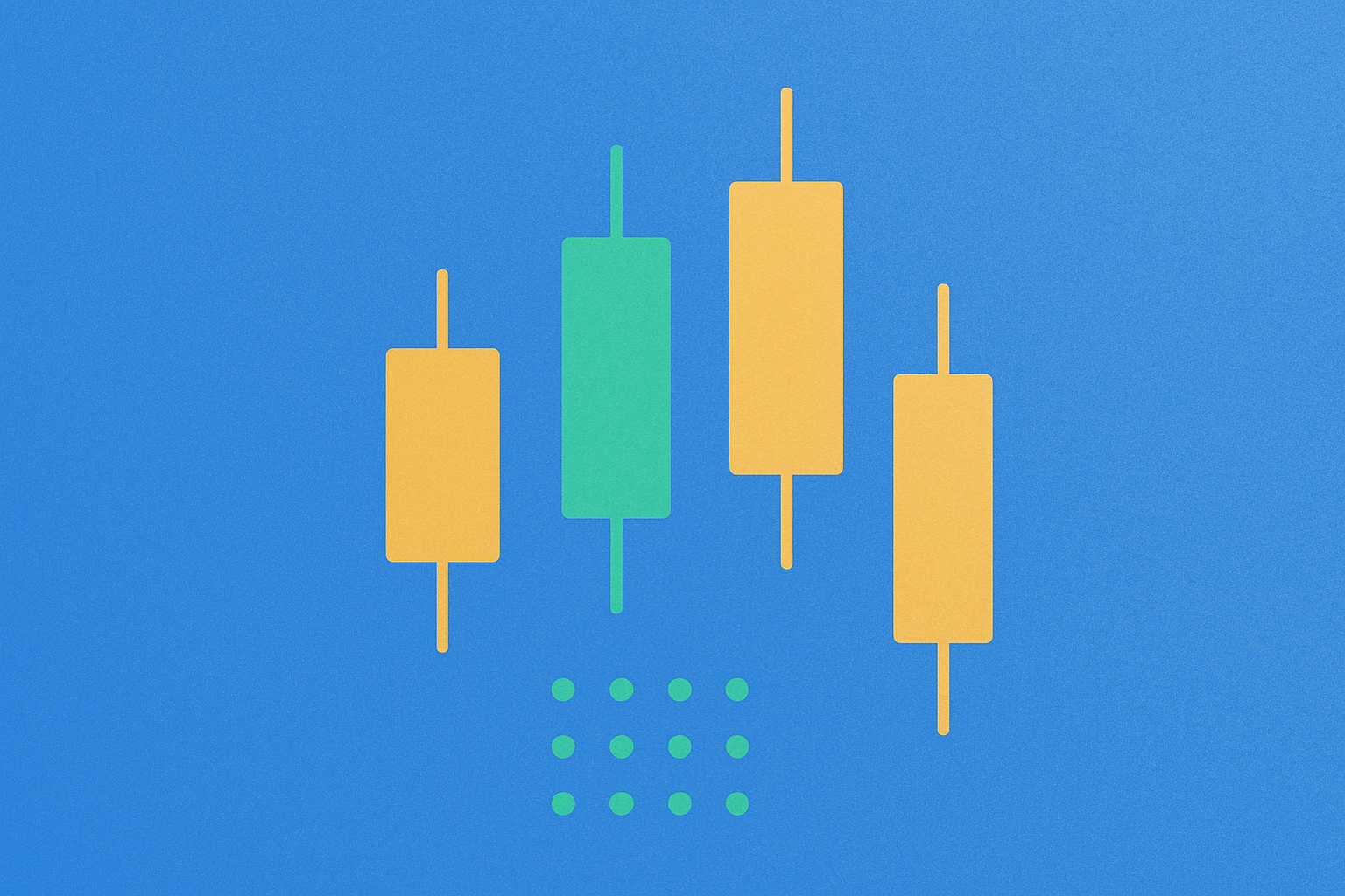
A candlestick chart is a financial chart that graphically displays an asset’s price movements over a specific time frame. Each "candlestick" represents an identical time interval, whether seconds or years, depending on your analysis needs.
Candlestick charts date back to 17th-century Japan, where they were originally developed to analyze rice markets. The technique is credited to Japanese rice trader Homma, whose insights laid the groundwork for today’s modern candlestick charts. Over centuries, experts such as Charles Dow—regarded as a founder of modern technical analysis—refined and evolved this charting method.
Although candlestick charts can be applied to various data types, they are primarily used for financial market analysis. When applied correctly, candlesticks help traders assess the likelihood of price movements and reveal key market patterns.
How Do Candlestick Charts Work?
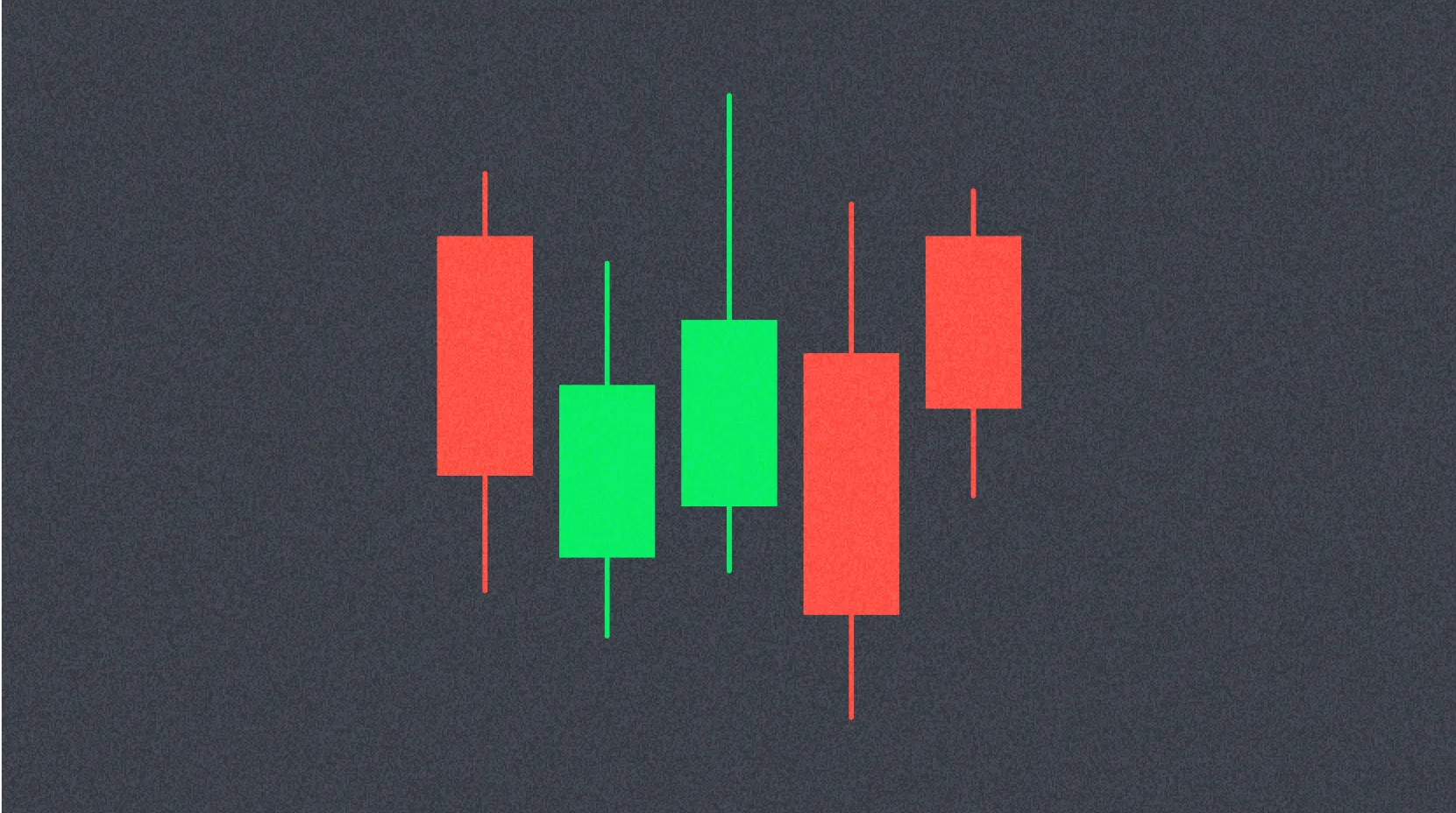
Each candlestick is defined by four key price points: Open (the asset’s first trading price during the chosen interval), High (the highest price reached), Low (the lowest price for that period), and Close (the last price at the end of the interval).
This set of data is known as the "OHLC values"—Open, High, Low, Close. The interplay between these prices shapes the candlestick’s appearance and the narrative it conveys.
A candlestick’s visual structure includes distinct elements: the space between open and close forms the body, while the lines connecting body to high or low are called wicks (or shadows). The total span from high to low illustrates the candlestick’s full range, highlighting the period’s volatility.
How to Read Candlestick Charts
Many traders find candlestick charts easier to interpret than bar or line charts, despite delivering similar information. Learning to read candlesticks is straightforward and provides a clear, intuitive picture of price action within any timeframe.
A candlestick visually represents the struggle between bulls (buyers) and bears (sellers) over a period. Typically, a longer body signals stronger buying or selling pressure. Short wicks indicate the high or low was near the closing price, reflecting minimal volatility at the extremes.
Candlestick colors and configurations may vary across charting platforms. Generally, a green body means the close was higher than the open—signaling upward movement. A red body means the price dropped, with the close below the open. Some analysts prefer black-and-white charts for accessibility, showing upward candles as white and downward candles as black.
What Candlestick Charts Don’t Reveal
While candlesticks offer a broad view of price action, they don’t tell the full story needed for deeper analysis. Notably, they don’t show in detail what happened between the open and close—only the distance between those points, along with high and low values.
For instance, although wicks mark the period’s high and low, they don’t indicate which level occurred first or the sequence of price changes. These details can be vital for understanding market dynamics. Most charting tools allow users to adjust time intervals and zoom in for more granular price movement insights.
Candlestick charts can also reflect significant market noise—especially in short timeframes. Rapid changes may complicate interpretation and lead to hasty conclusions. Therefore, many traders combine candlesticks with other technical indicators to validate signals and support better decision-making.
Heikin-Ashi Candlesticks
So far, we’ve focused on traditional Japanese candlestick charts. However, there are alternative plotting methods. Heikin-Ashi is one of the most popular and effective candlestick chart variations.
Heikin-Ashi translates to "average bar" in Japanese and introduces an innovative way to visualize price data. These charts use a modified formula based on average prices, delivering a new perspective on market activity. The primary aim is to smooth price fluctuations and filter out market noise, making trend analysis clearer. Heikin-Ashi candlesticks can simplify the detection of market trends, price patterns, and potential reversals.
Traders often combine Heikin-Ashi candlesticks with traditional Japanese candlesticks to avoid false signals and improve trend identification. Green Heikin-Ashi candles without lower shadows typically indicate a strong bullish trend, while red candles without upper shadows suggest a strong bearish trend. These visual cues enable quick and reliable interpretation.
Despite their power, Heikin-Ashi candlesticks have limitations. Since they rely on average prices, patterns may take longer to form, and they don’t show exact price changes—sometimes obscuring crucial short-term data.
Conclusion
Candlestick charts are invaluable tools for traders and investors aiming to understand and analyze financial markets. Learning to read candlesticks offers an intuitive visual of price action for any asset, plus flexibility to analyze data across timeframes—from minutes to years.
Consistent study of candlestick patterns, paired with analytical thinking and hands-on practice, can deliver a competitive edge. For optimal results, recognize that candlestick analysis is most effective within a comprehensive strategy. Leading traders and investors agree: supplement candlestick charts with fundamental analysis, additional technical indicators, and sound risk management to make well-informed investment decisions.
FAQ
How Can I Learn to Read Candlestick Charts?
Study the basics—open, close, high, and low—and learn to identify patterns like doji, hammer, and engulfing. Examine body and wick relationships to spot trends and reversals. Practice regularly with real charts to build intuition.
How Do You Analyze a Candlestick Chart?
Review each candle’s open, close, high, and low. Spot patterns such as Doji and Engulfing to anticipate price moves. Evaluate trend direction and strength by examining candle sizes and color conventions.
How Do You Read the Chart?
Identify price and time axes, then examine candlesticks for open, close, high, and low. Analyze trends, support, and resistance levels. Candle color signals direction (green for upward, red for downward), while height indicates volatility and aggregate trades show market strength.
How Do You Know If a Candle Will Rise or Fall?
Check the candle’s color: green means an upward move, red signals a downward move. Analyze formation patterns, trading volume, and key support/resistance levels. Combining these technical indicators helps you spot price trends.
What Are the Main Components of a Candlestick (Open, Close, High, and Low)?
The four key candlestick elements are: open (initial period price), close (final price), high (peak price), and low (lowest price). These data points form the candlestick’s visual chart.
What Is the Difference Between Red and Green Candlesticks?
Green candles show the closing price is higher than the opening price, indicating a bullish move. Red candles show the closing price is lower than the opening price, indicating a bearish move.
* The information is not intended to be and does not constitute financial advice or any other recommendation of any sort offered or endorsed by Gate.